
Analytics dashboard

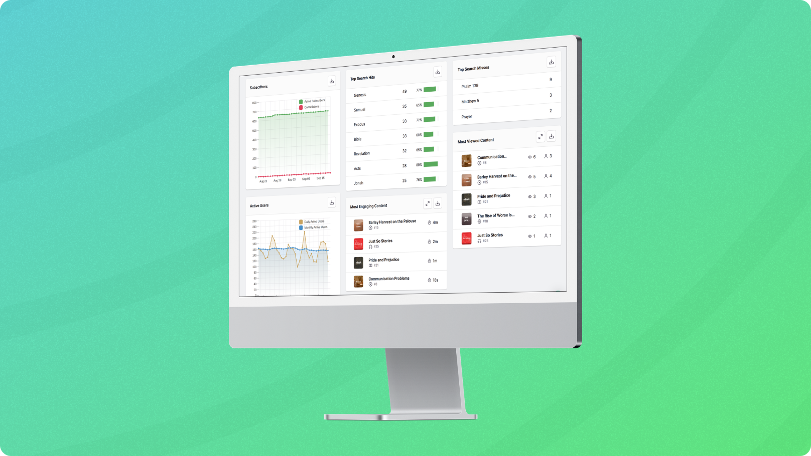
We’re excited to announce the launch of a brand new Treefort analytics dashboard replete with helpful charts, graphs, and stats. This feature is designed to help you better understand your audience and ultimately make more informed decisions about how to serve them.
The dashboard includes a mix of metrics that were already available (but were quite difficult to gather) as well as brand new, never-before-seen stats. A few examples:
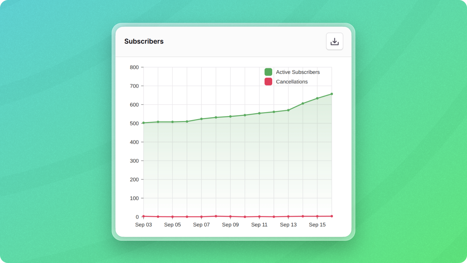
- Subscribers: Take a look at this chart for historical subscription and cancellation numbers. See how you’re trending without tallying up numbers across Stripe, App Store Connect, and the Play Console.
- Shares: See which content is being shared the most by your users.
- Searches: See what users are searching for in your app - and if they’re finding it. Search misses can be particularly interesting. Sometimes these will just be severe misspellings, but often they will highlight content that you don’t have but that your audience would like from you.
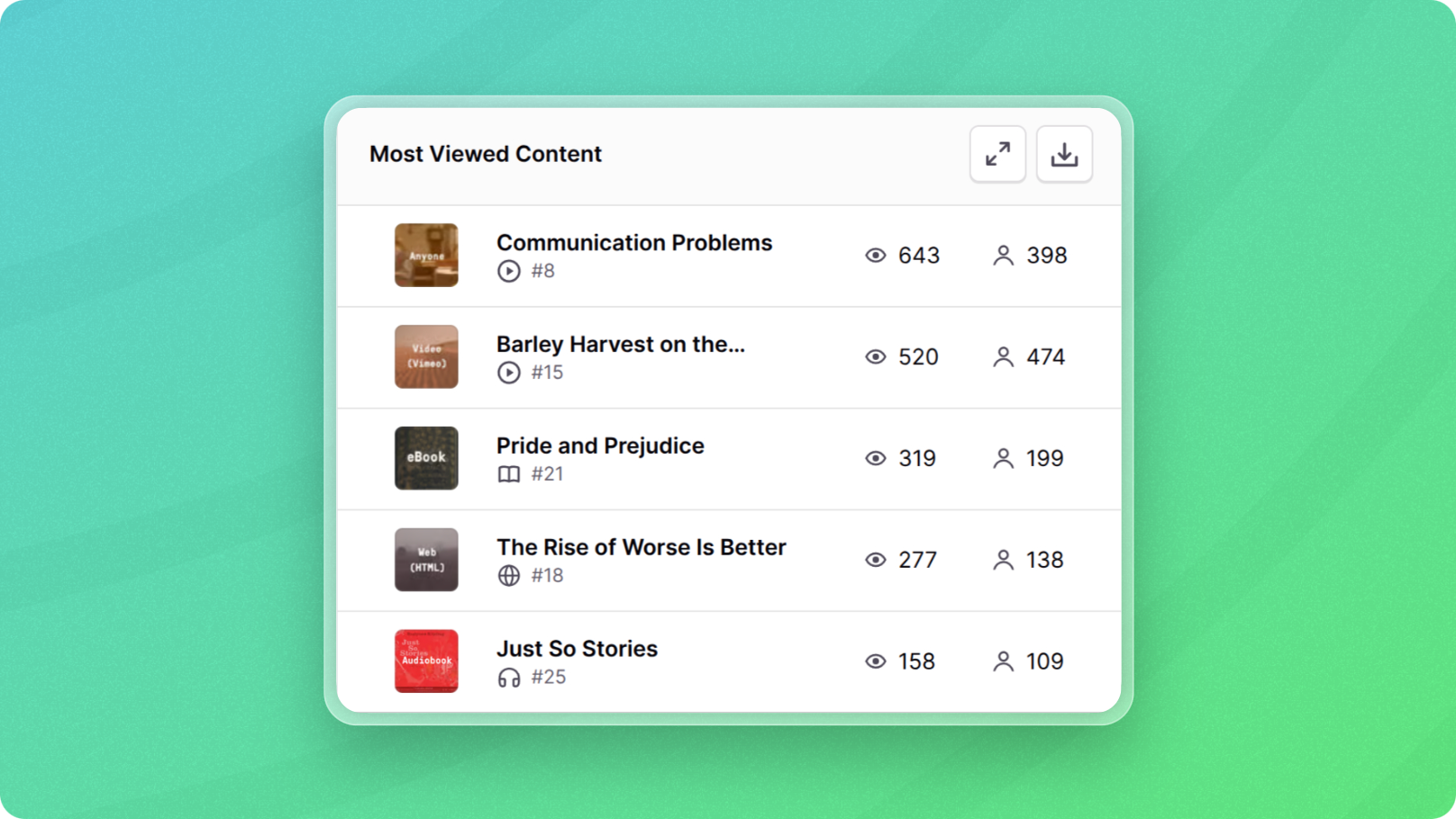
- Engagement: See at a glance your most engaging content. Click the little expando button above each mini table to open the data in the full filterable/sortable analytics table that you’re already familiar with.
Aside from the fresh look, it’s worth noting that this dashboard is powered by our own in-house analytics system. This means that we control the data and don't share it with anyone but you. This helps protect your audience’s privacy, but it also gives you more accurate numbers. Data sent to our system is less likely to get swallowed by an ad blocker than if it went through one of the big third-party trackers.
We hope you find this feature useful! As always, let us know if you have questions or feedback.
Written for you by a human at Treefort